Chivas Regal
Package Design, Brand Identity

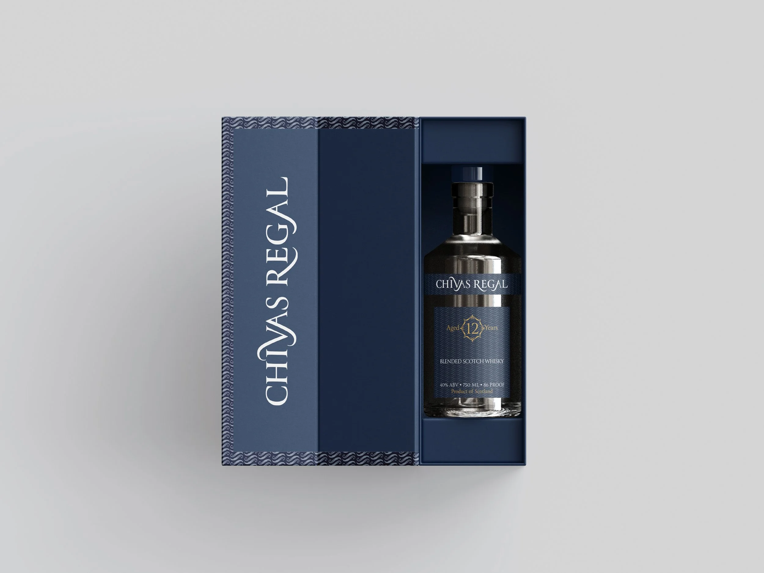
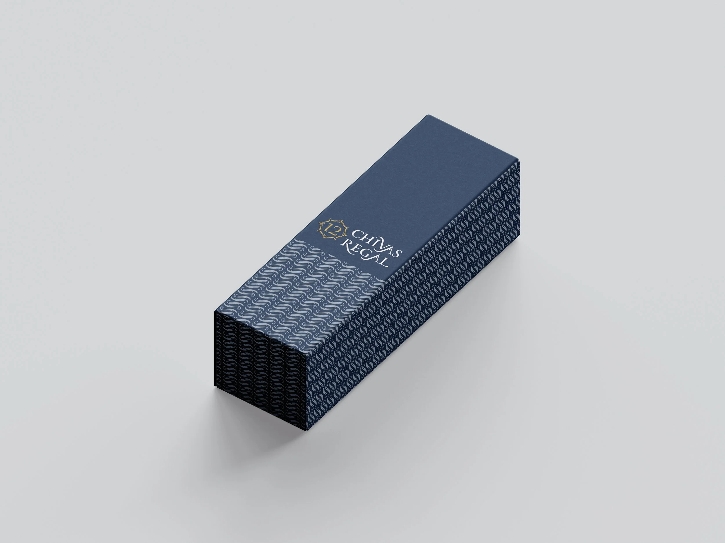
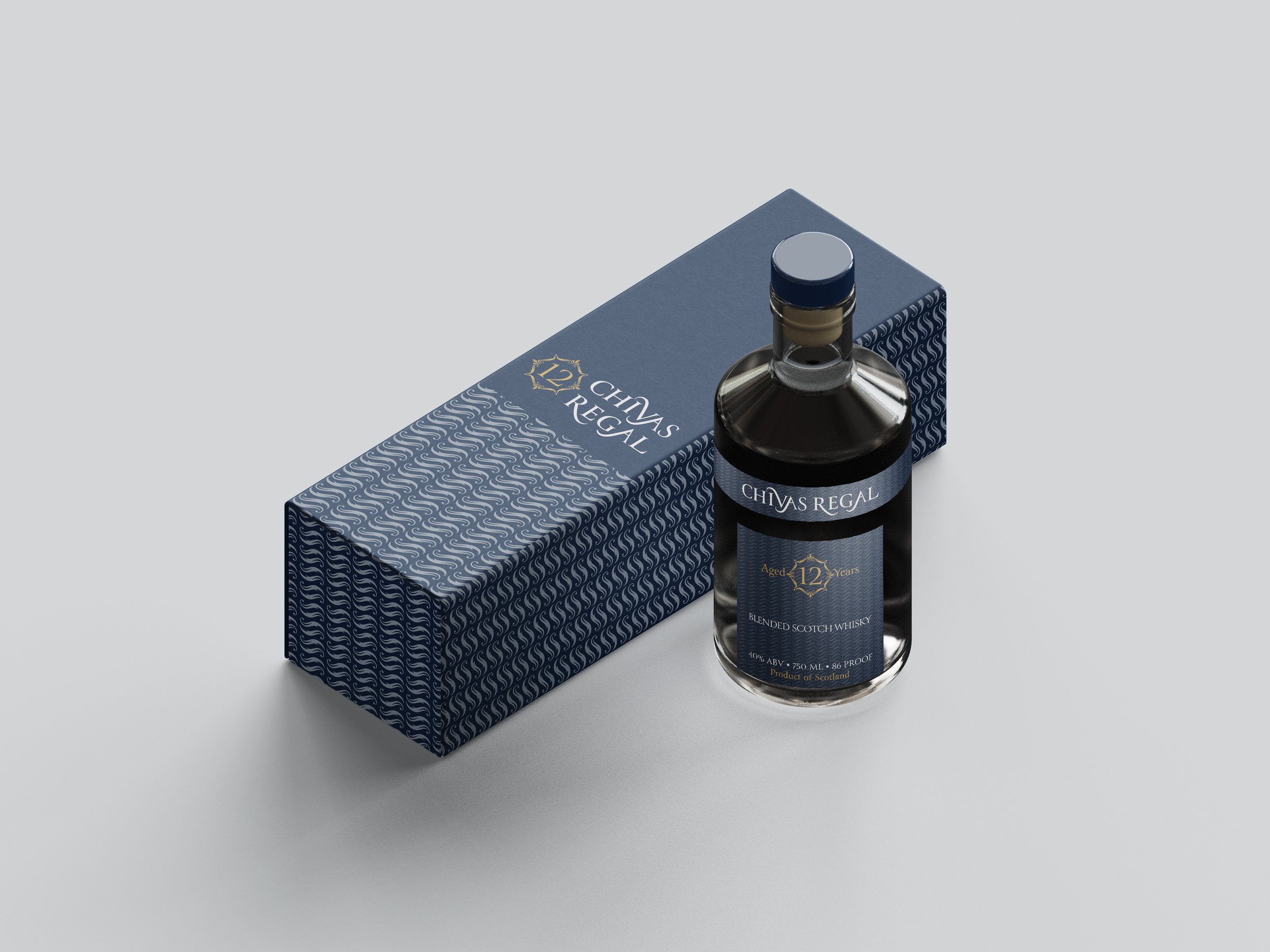
The visual identity was pared back to its essentials, replacing ornate flourishes with sleek geometry and restrained typography. Deep navy tones and metallic gold accents convey quiet prestige, while subtle patterns nod to the craftsmanship and tradition behind the blend.

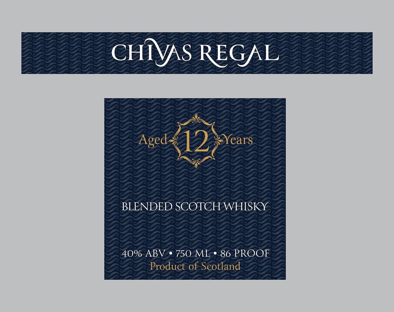
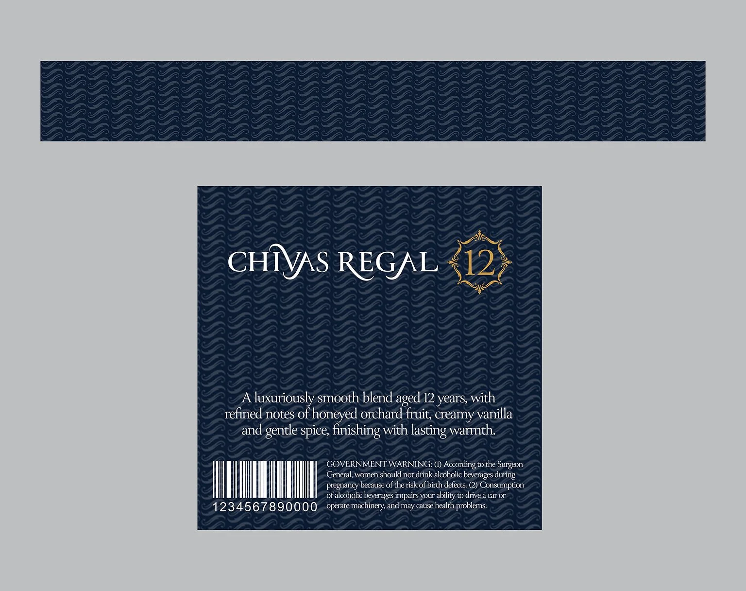
This reimagining of Chivas Regal was rooted in the balance between heritage and modernity, honoring the brand’s storied legacy while speaking directly to a new generation of Scotch drinkers. The packaging was designed not only to protect the bottle, but to become part of the experience—an understated statement piece that fits seamlessly into a curated lifestyle. Every detail, from the tactile feel of the box to the alignment of the lid, was considered to appeal to an audience that values authenticity, design, and cultural capital. This was not a departure from Chivas Regal’s roots, but a distillation of them—elevated tradition, presented with a fresh face.